The “Wrong” Design for the Right Fest
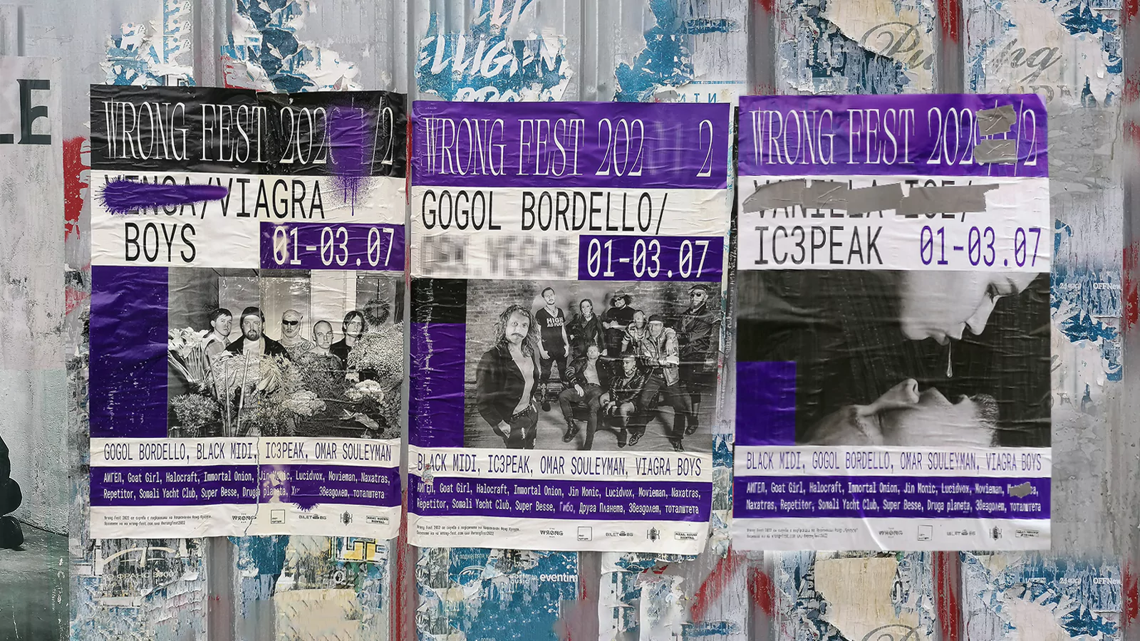
Wrong Fest, the Bulgarian music festival that stands out as an antithesis of mainstream music events, showcases a mix of lesser-known artists each year. This was the second time we collaborated on its visual identity, so the challenge was clear— to stay true to its gritty character while offering something fresh.

Drawing inspiration from the turbulent global environment—the pandemic’s aftermath and the backdrop of a war unleashing in Europe, we created a design that mirrored the festival’s unpredictable nature. The slogan “what is wrong gets crossed out” summed up the theme of constant change, where the lineup, dates, and event venues were in flux. We embraced the chaotic streetscape of Bulgarian cities—a mishmash of ripped ads and graffiti—steering away from clean lines and perfect order, making the unpredictability and imperfection central to the festival’s new identity.
From the punchy custom typeface to visuals that proudly wore their imperfections, this design resonated with audiences and made “wrong” feel utterly right.