Wrong Fest’s New Look
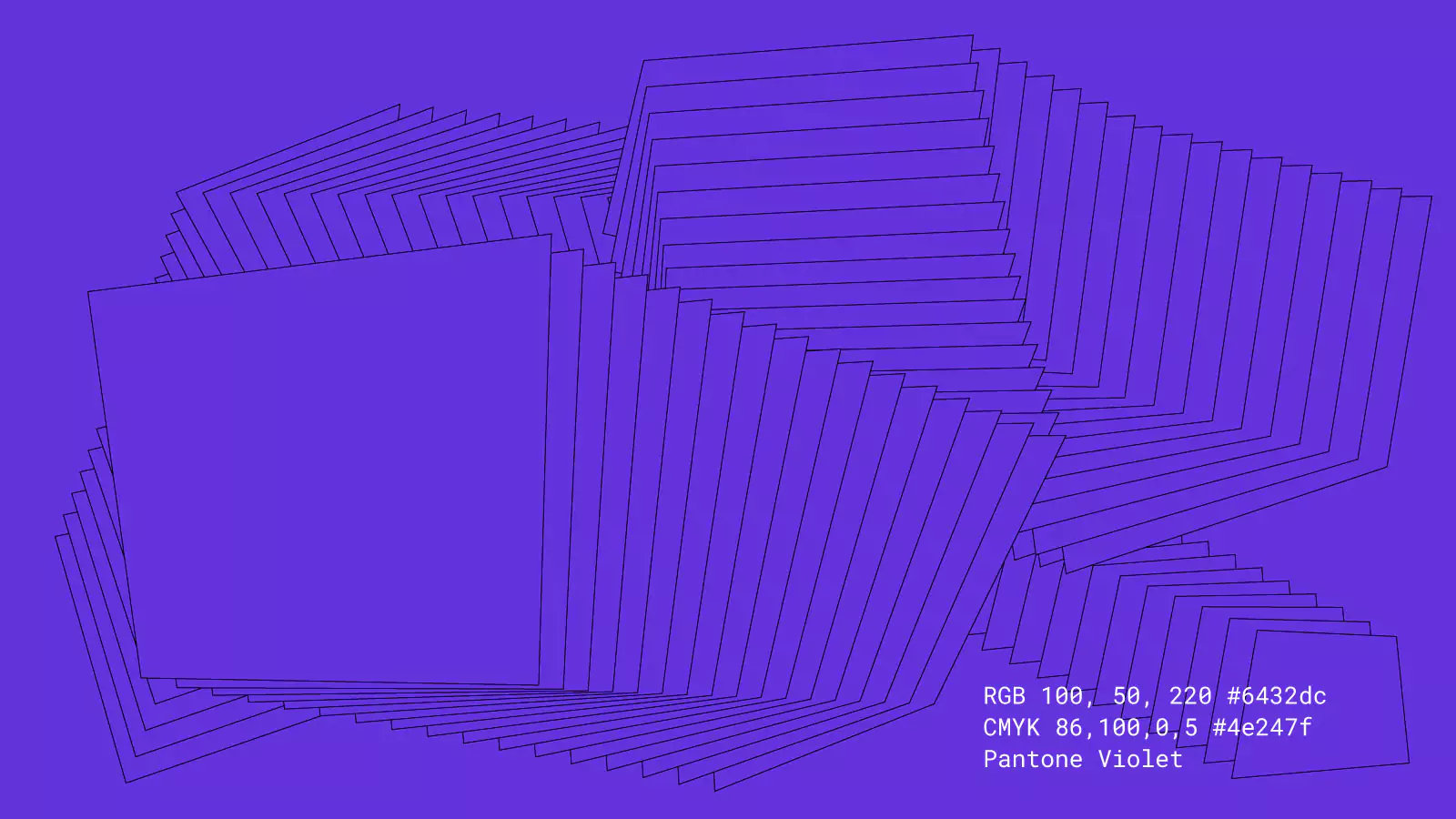
We partnered with Wrong Fest, Bulgaria’s niche music festival, to redefine its visual identity. Our design features custom typography, edgy purple tones, and the dynamic ‘wrong square,’ embodying the festival’s quirky and alternative spirit.

Wrong Fest approached us to develop a brand identity as unconventional as its nature. Known for providing a platform for emerging artists and giving its public the chance to explore and encounter new music and talents, the festival needed visuals that resonated with its bold character.


We embraced the challenge by creating a custom monospaced typeface, ‘Wrong Serif Mono,’ paired with a matching sans for versatility. Vibrant purple—a nod to the previous branding—added a rebellious edge, while the ultra-condensed typography pushed boundaries, celebrating “wrongness”. The centrepiece? The ‘wrong square,’ a morphing graphic element symbolises the festival’s fluid, unpredictable nature. Our work culminated in a cohesive yet daring identity that stands out, perfectly capturing Wrong Fest’s unique appeal.