A Visual Identity Bridging Past and Present
We designed a visual identity for Villa Flavia that bridges history and modernity. Inspired by Roman artifacts, the hotel’s facade and a sculpture in its yard, we created a custom logotype and layered brand system symbolizing the passage of time. Applied across signage, wayfinding, and stationery, the design immerses guests in the hotel’s story, making Plovdiv’s legacy a living experience.
Brand Guidelines
Brand Guidelines
Brochures & Flyers
Brochures & Flyers
Lettering
Lettering
Logo
Logo
Signage & Wayfinding
Signage & Wayfinding
Stationery
Stationery
Visual Identity
Visual Identity

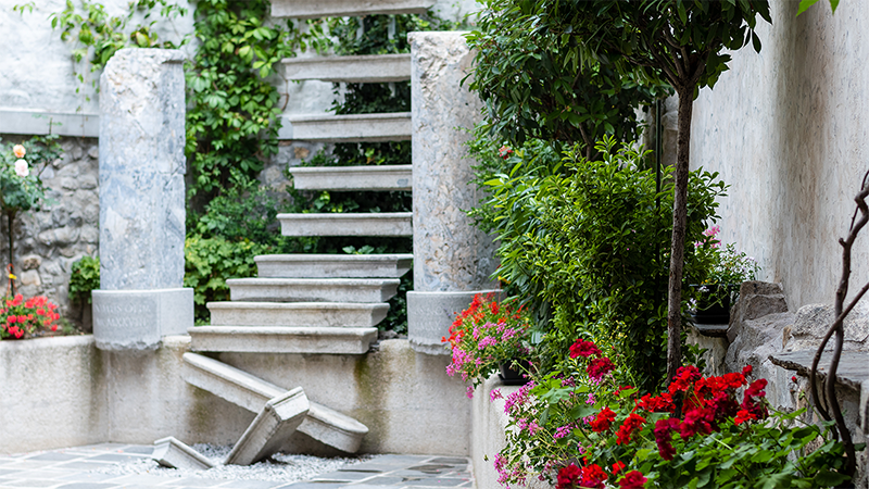
Villa Flavia is a bridge between past and present, offering guests an immersive journey through Plovdiv’s layered history. Our approach to its visual identity was rooted in this duality—honoring Roman heritage while maintaining a sense of modern elegance. A key inspiration was Ognyan Chitakov’s sculpture in the hotel’s courtyard, which echoes themes of time and continuity. This concept became central to our design thinking and significantly influenced the logo design process. The brand system reflects the hotel’s meticulous attention to detail, seamlessly intertwining history and modernity to embody Villa Flavia’s motto: Experience the past. Celebrate the future.


The visual identity of Villa Flavia is deeply intertwined with the city’s rich history and architecture. We drew inspiration from the Roman artifacts discovered near the hotel, the elegant symmetry of its iconic facade, and the craftsmanship of ancient stone carvings masters.
The custom logotype is based on Roman capitals, featuring low contrast and hidden serifs that evoke ancient inscriptions, reinforcing a sense of continuity between past and present. Complementary graphic elements add further layers of meaning—two horizontal strokes beneath the lettering represent the hotel’s deep historical beginning (experience the past), while the two above symbolize the forward-looking vision of its existence (celebrate the future). The logotype itself, positioned between the graphic elements, embodies Villa Flavia as the intersection of time, where history and modernity coexist.


The structured yet minimalistic aesthetic extends to the brand’s color palette, which consists of a deep brick red, reflecting the building’s façade, and warm gold, a nod to the name Flavia—Latin for golden. To enhance the brand’s timeless yet contemporary character, we carefully selected PT Sans and Fira Sans—two typefaces that merge classical influences with modern proportions. This holistic design approach ensures that every detail, from typography to color, speaks to Villa Flavia’s story with elegance and clarity.


Villa Flavia's visual identity extends far beyond a logo and color schema. It is an integral part of the hotel’s atmosphere. From illuminated signage at the entrance to custom stationery, doormats, and even bespoke wine bottles, every detail embodies the brand’s refined aesthetic. The visual language is seamlessly integrated into the hotel’s wayfinding system, from street signs to archaeology plaques and interior navigation, ensuring a cohesive and immersive guest experience. Overall, Villa Flavia’s identity subtly guides visitors through time as they explore this extraordinary space.


