Ironman’s Legacy
It all started around the 1980s when painter Dimitar Dobrev spotted a beautiful historical iron being thrown away. Since then, he has collected more than 1,200 artefacts, some dating back to the 17th century. Fast forward to 2026, and his collection now has its own unique museum called The World of the Iron.
Regional Ethnographic Museum – Plovdiv
Custom Illustration
Custom Illustration
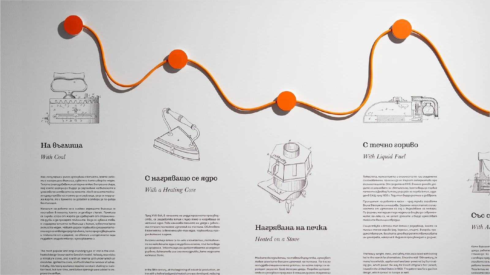
Data visualisation
Data visualisation
Digital Campaigns
Digital Campaigns
Explanatory Animation
Explanatory Animation
Iconography
Iconography
Interaction design
Interaction design
Logo
Logo
Signage & Wayfinding
Signage & Wayfinding
Space Branding
Space Branding
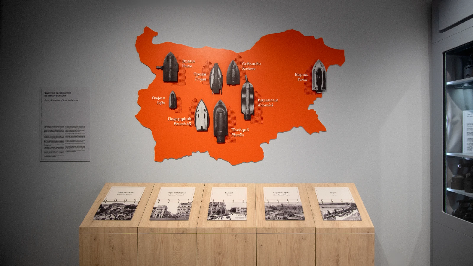
Our challenge was to create a visual identity for an exhibition dedicated to one of the most ordinary household objects imaginable. Yet, as we immersed ourselves in the collection, it quickly became clear that these objects were anything but ordinary. Behind every iron was a story of technological progress, changing lifestyles, and the evolution of domestic culture.
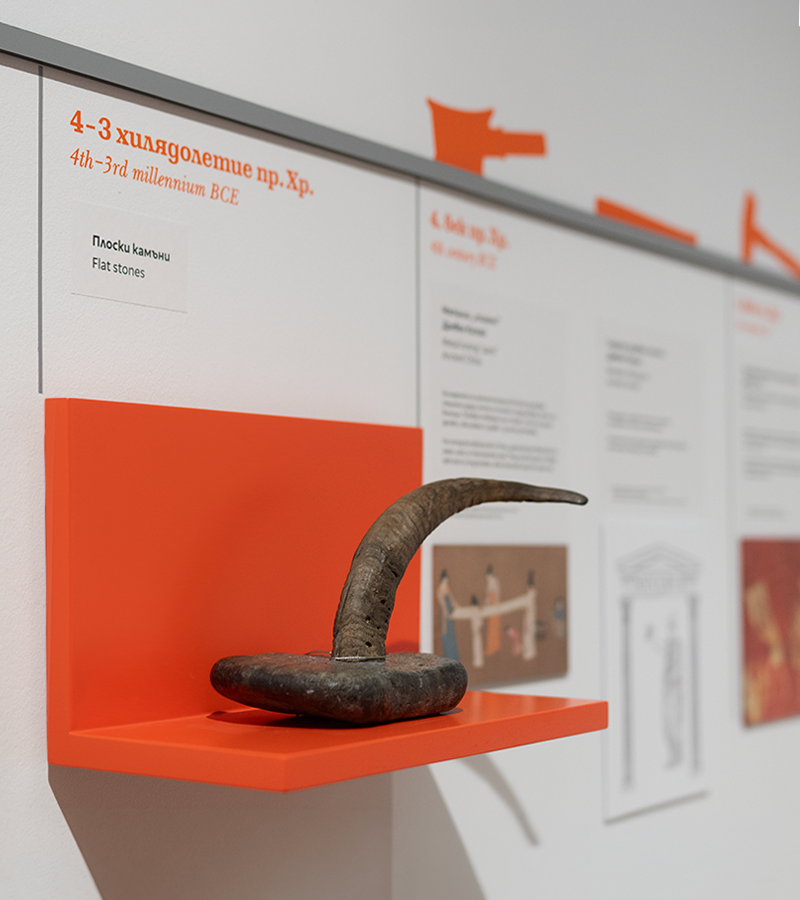
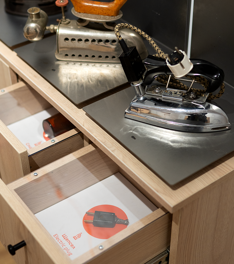
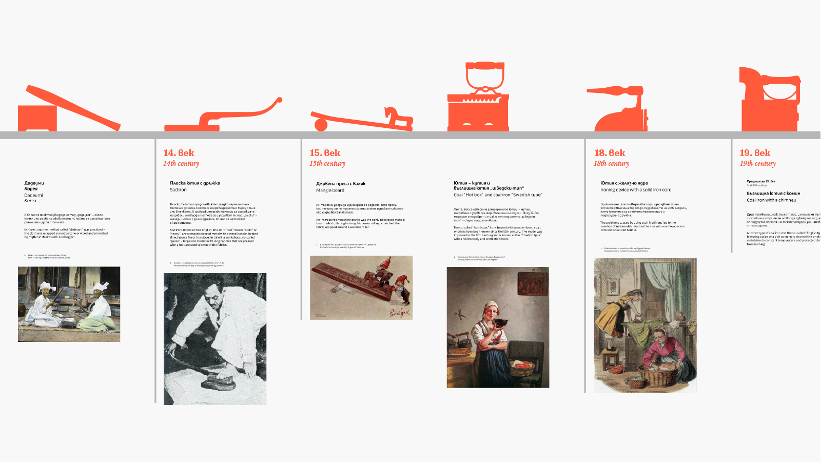
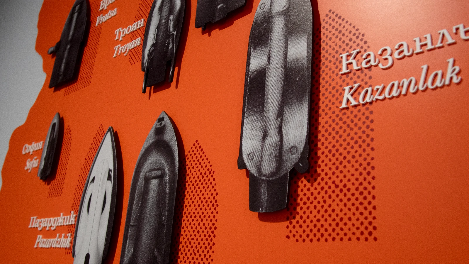
The process began with exploring the exhibition itself and uncovering the remarkable diversity of its artefacts – from coal and cast-iron models to early electric designs. What initially seemed like a niche subject revealed a fascinating timeline of human ingenuity, spanning continents, generations, and design.
We teamed up with the exhibition designer Martina Venkova and came up with a visual identity inspired by the moment when the iron is as hot as it gets – and its plate is about to burst. In doing so, we wanted to capture the essence and energy hidden within this ordinary object.
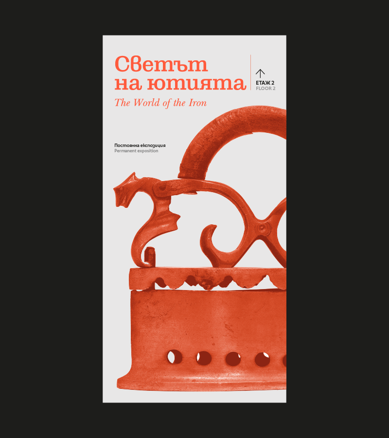
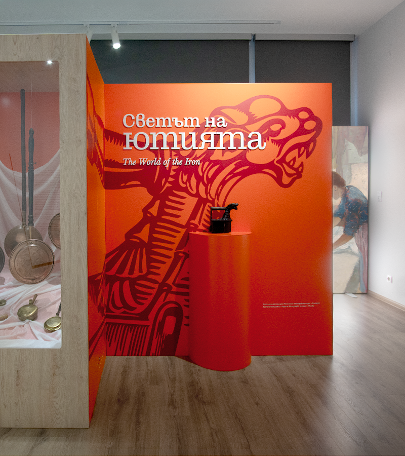
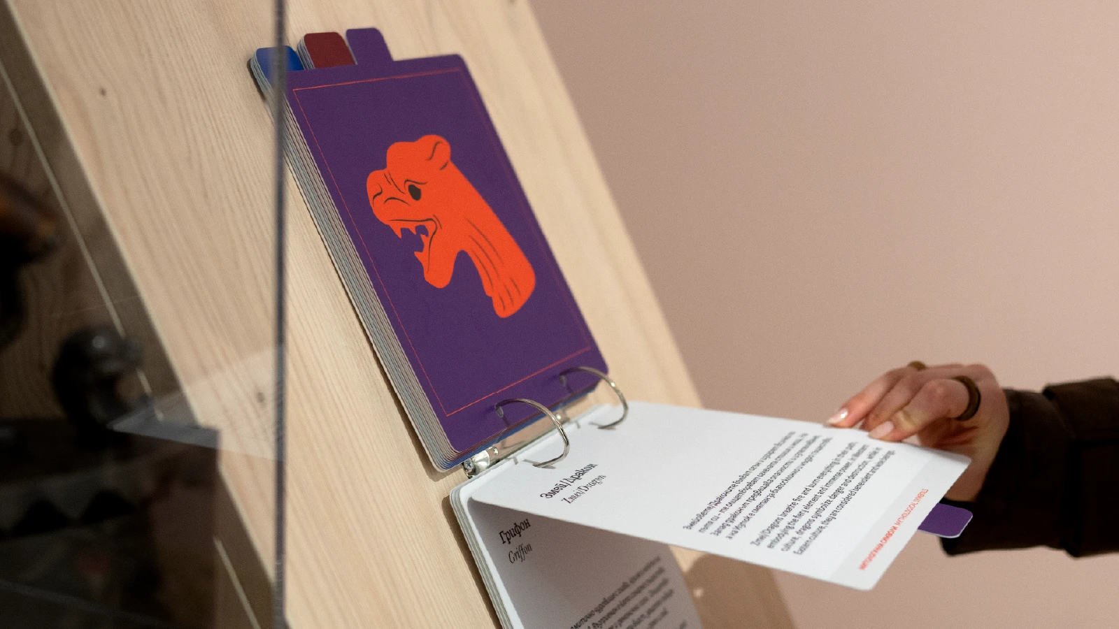
The result is a visual system based on a fire orange, mixed with all the astounding details we found on the artefacts during our extensive research. And to wrap it all up, we chose the Scotch Roman typeface by Trifon Andreev, giving the identity a historic character worthy of an institution of this stature. The typeface combines the refined elegance of 19th-century Scotch Roman forms with the bold, attention-grabbing presence of Clarendons.
Overall, the whole project took more than a year, and at the end, our team got so involved in the process that we had the chance to contribute content ideas for some of the halls. That’s when we came up with the playful last room, where we had the creative freedom to draw illustrations and incorporate fun facts into engaging games for children.
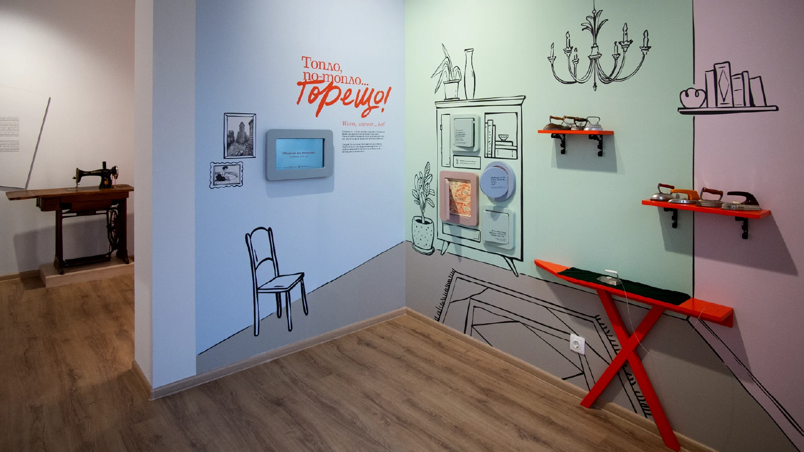
Last but not least, we had the pleasure of creating the exhibition's headline and verbal identity: Warm, Warm, Hot! Inspired by the familiar childhood game of searching for hidden objects, the phrase perfectly captures both the function of the iron and the spirit of discovery that runs throughout the exhibition.


